
AI
R(e)volution of Design Systems

I was exploring how AI redefines design systems. I see the future of design systems focusing on personalization, interconnected systems, and AI-assisted design.
Where We Stand
We have self-driving cars. We even have flying cars in testing. But when it comes to design, it's like we're still in the past. We draw buttons, check paddings, align icons with text, and create variants.
Yet, this isn't the end of our story.
Let's step back and check what we need to change and how design systems evolved.
A Quick Look Back

Screen sizes: The Game Changers
Remember when the iPhone and iPad hit the market? They changed how we thought about design. Suddenly, we had to think about apps on different screens and gestures. Now, imagine half of the planet using smartphones - that's where we are!

Software: Closer to Users Than Ever
Now, let's talk software. We've moved from the 'build it in your garage' era. Getting to know our users and their behavior is easier than ever. It is all about iterating, testing, measuring, and finding that sweet spot where your product resonates with the market.
And this is what we should also think about for our design system. Start, refine, repeat.

Design apps
Remember the days before Invision and Sketch in 2010 or when Photoshop introduced layers in 2015? But when Figma launched in 2016, it revolutionized how we think about design collaboration.

Material Design
Google's Material Design, introduced in 2014, was a game-changer. It streamlined development, even if it meant a sea of similar-looking apps. But it was a step towards faster, more efficient design processes and is still a key player in design systems.
AI enters design
Here's where it gets exciting!
The recent acquisition of Diagram by Figma is a big deal. It's bringing AI closer to product design, opening doors to new possibilities and efficiencies.
Then there's Galileo AI, Musho, Uizard pushing the boundaries of what's possible in design with AI's help.
Patterns AI is an exciting new frontier, generating components based on your existing design system.

As you can see, we started with basic style guides and pattern libraries. Our journey from graphic design to sophisticated design systems has been long. Design systems today aren't plug-and-play, and that's great. Design systems show how we work together, so we must build them together. Whatever happens in between can be optimized.
Let's check where we need to be better.
Boring documentation
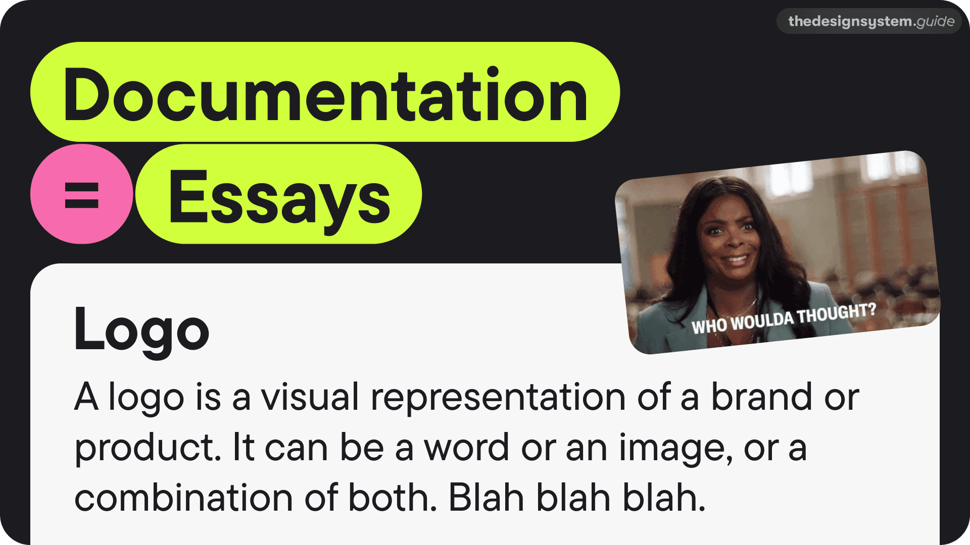
Documentation shouldn't be a chore to read. No one has time to read lengthy, boring descriptions without valuable information. We need to know what fits together, where to find things, and who to contact when lost.
Meeting after meeting
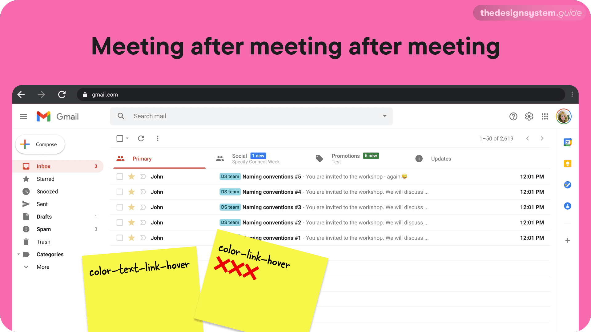
Because there is so much noise, we prepare workshops, meetings, and discussions. "How should we name this component?" We want to be inclusive; that's why we invite cross-functional teams. We vote for solutions, but half of the participants don't know what they are doing. You know how this ends. It's not well.
The Education Gap
Many companies assume their teams are well-versed in design systems, but that's only sometimes true. Without proper training and onboarding, we risk inefficiency and duplicated efforts. That can get exhausting.
Tools standardization
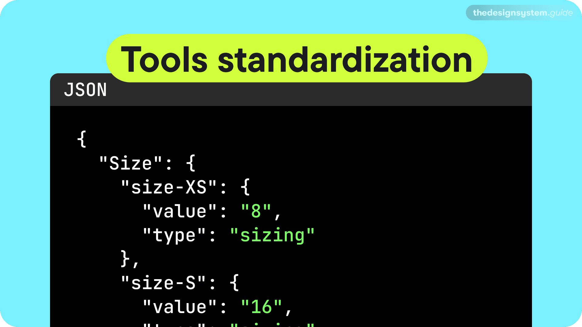
Now, if I move to the more technical side. There is no standardization. Poor JSON file is still isolated. There is no way to take the design tokens from one file and inject them into Adobe, Canva, or wherever to have a consistent foundations library.
So, most of the teams are stuck with these problems:
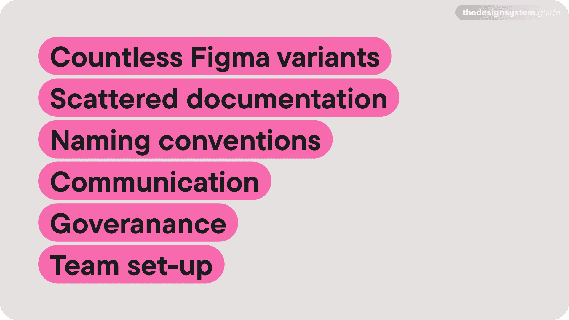
Countless Figma variants
Scattered documentation (Figma, Confluence, Storybook, Other off-the-shelf apps)
Communication
Governance
Naming conventions
etc.
Let's talk AI
The good news is that AI can streamline many of these challenges. By automating repetitive tasks, AI frees up our time for more creative and strategic work. For example, we could focus more on spatial and voice interactions.
AI: More Than Just Algorithms
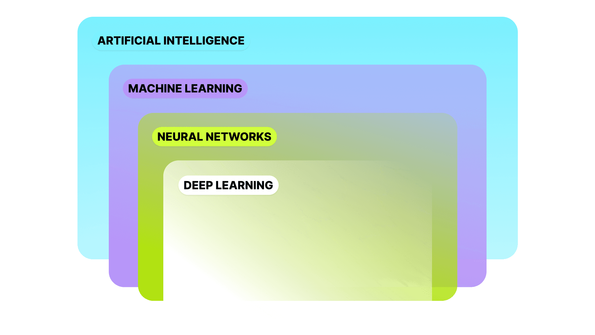
AI encompasses machine learning, neural networks, and deep learning. Each plays a unique role in understanding and predicting user needs.
↪ Machine learning
can analyze trends and how consumers use patterns.
recommends the best next step.
can feature the ones with problems.
but still needs human help -> ongoing learning and putting in human feedback.
↪ LLM
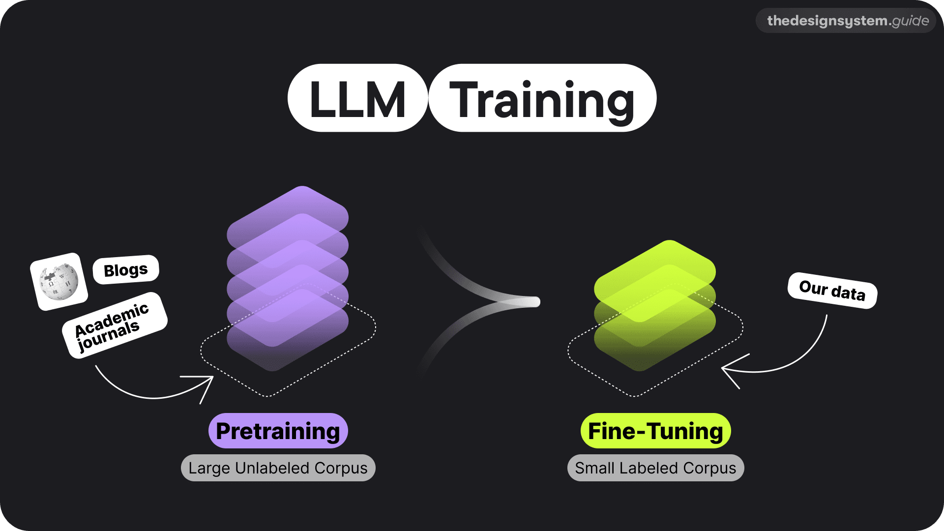
LLM stands for Large Language Models, a deep learning neural network type within artificial intelligence and machine learning.
These models undergo initial training on extensive datasets from varied sources like Wikipedia, blogs, and academic journals. This phase equips LLMs with a broad understanding of language. Developers then update them to make more precise output predictions for specific Natural Language Processing (NLP) tasks.
The pretraining phase demands significant computational power and state-of-the-art hardware. However, once trained, these models become versatile tools, adaptable for a wide range of applications through fine-tuning.
Take OPEN AI's GPT models as an example. They have done the heavy lifting by pretraining CHATGPT. I leveraged this foundation, added new data, and tailored it to create The Design System Guide GPT.
Understand - Summarize - Predict - Generate.
Now that you know how all this works, let's translate it into the world of design systems.
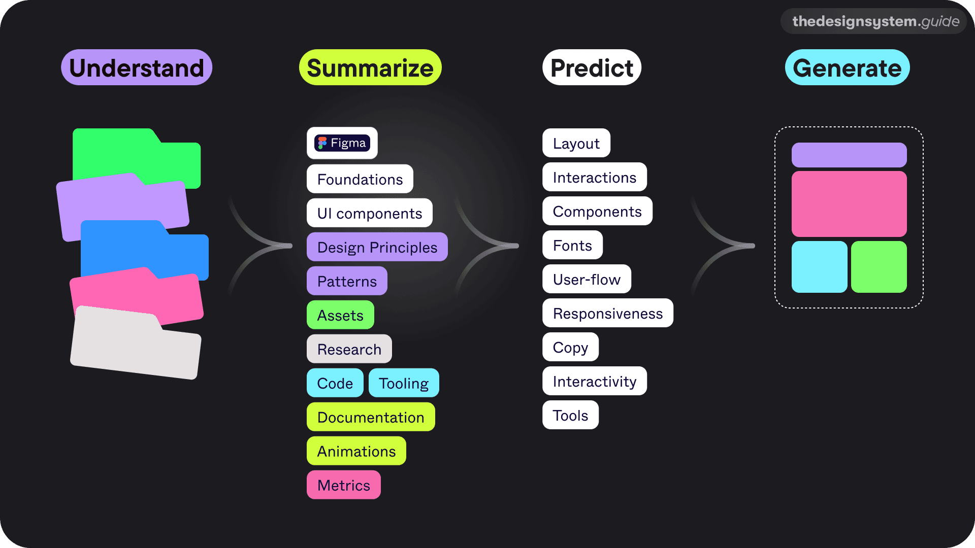
Understand: First, AI dives into everything we've created – the components, the files, the design tokens. Whatever we have.
Summarize: Then, it gets a grip on our design language, understanding the nuances of our components and files.
Predict: Here's where it gets exciting. AI starts anticipating what we'll need next – the layouts, interactions, and even the flow of our designs.
Generate: Finally, it combines all it has learned and generates design elements independently.
So, in reality, we are creating a system of systems. That's why I see AI Models as our thought partners.
The role of future designers will likely involve training these systems and crafting the rules that guide machines in generating a diverse array of variations.
Now, imagine that we are in 2026. Or maybe even before, since things are moving soooo fast. 😅
IDEA 1: Personalized Guidelines
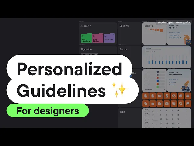
I believe in a future where personalization, AI, and interconnected systems converge to create personalized guidelines.
Let's look from the perspective of the product designer.
As product designers, we often have to find relevant data on Slack channels, Confluence, Notion, Google Docs, and Figma, and in the end, we still need to learn how to pair things together.
Imagine using conversational UI to input your needs.
"I need guidance for the new dashboard. Testing for gen Z. Shows current user behavior, stats, screens, and product design guidelines. Include recommendations."
Then I get bite-sized, customized, and shortened guidelines to quickly find all the relevant info and explore more if needed. So, no more boring descriptions. 😊
IDEA 2: Personalized Guidelines: A Business Perspective
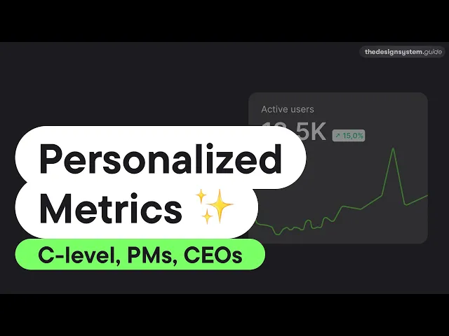
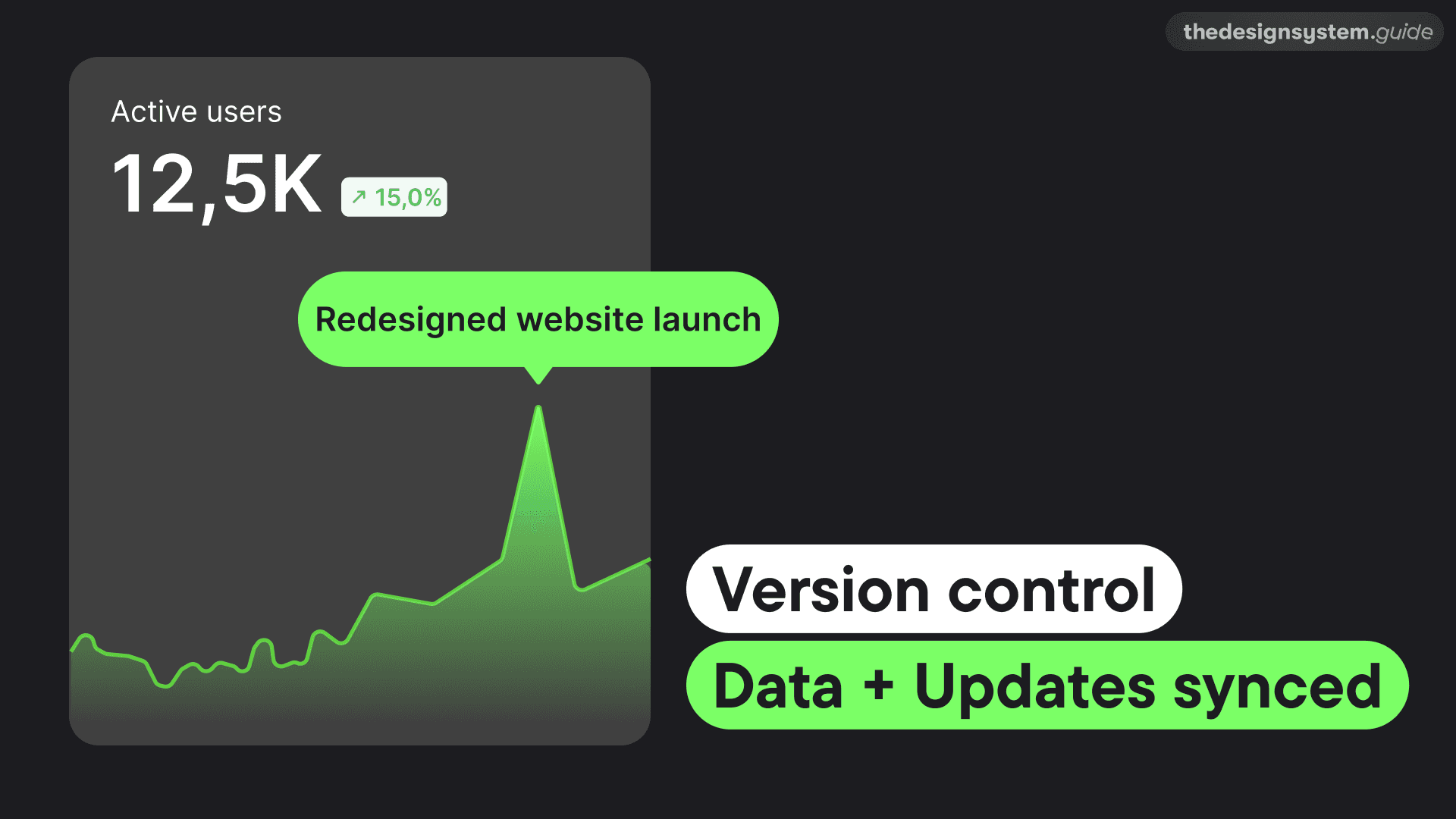
Okay, let's change perspective now. CEOs don't want to read stories of how someone detached a component. They require straightforward metrics over detailed design guidelines. Imagine a single dashboard aggregating performance data from multiple sources, enabling CEOs to assess if the product and design system are in harmony.
The future will be multi-modal, so it is wise to think about these scenarios now.
Another scenario.
You are probably using more than one app for tracking. So, imagine you could track performance from multiple sources in one dashboard. Compare current performance to goals, past performance, and more. And by seeing metrics, they will know if the product and design system are in sync.
IDEA 3: The Design Helper
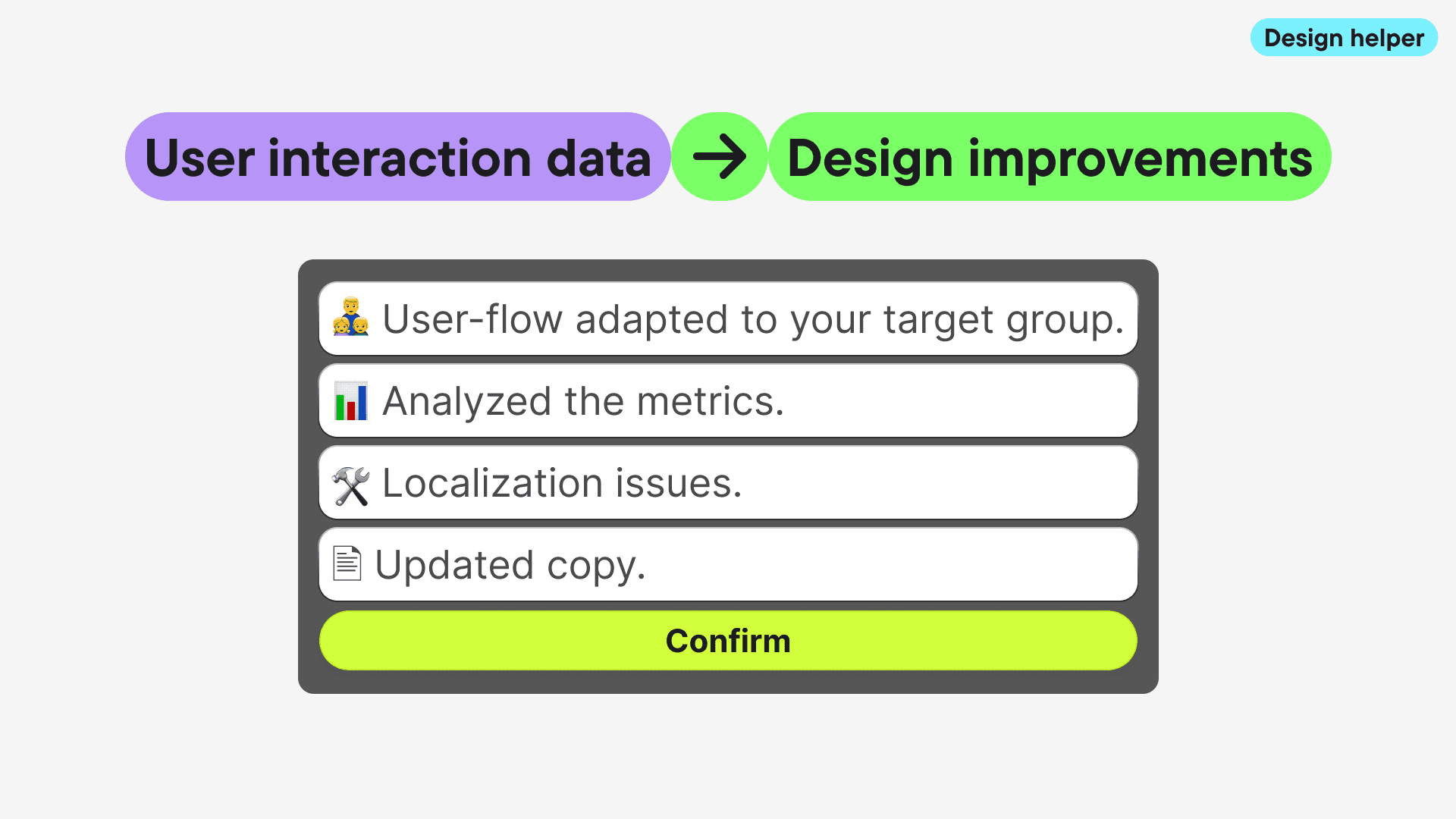
AI algorithms could perform real-time contextual analysis to adapt system behavior for a personalized user experience. Utilizing user interaction data, the system could suggest actionable design improvements.
Design Tokens Reimagined
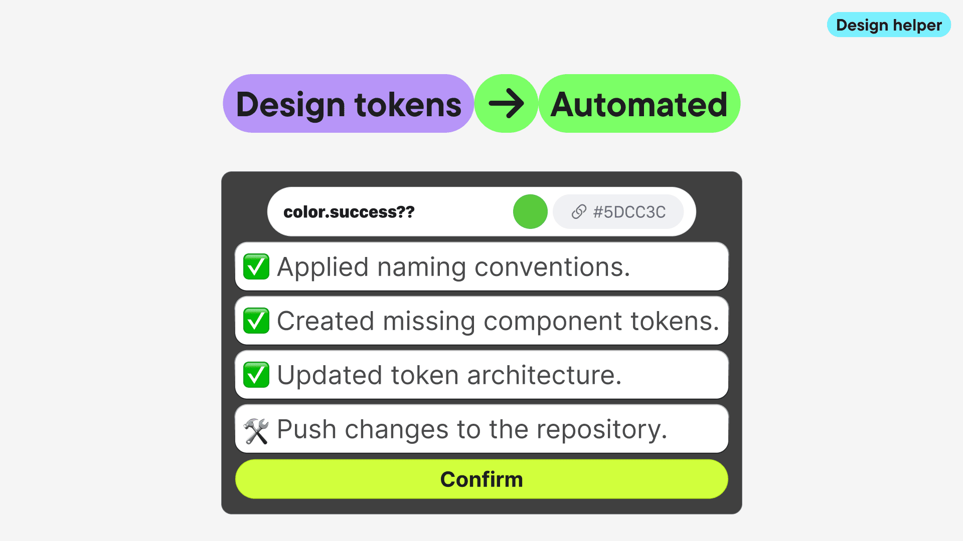
We have had loads of discussions about who needs to be aware of design tokens, who needs to set them up, etc., but in reality, we just want to speak the same language and stay n sync with developers. We should take away the complexity from designers, and just use AI for generating themes, design tokens.
For example, we could:
Apply the right naming conventions, automatically
Create missing component tokens, when someone misses it
Update token architecture based on our preferences
Create design tokens for new themes
Push changes to the repository
IDEA 4: Dynamic Prototyping
When you are building a product, you never sleep. You have to iterate, experiment, and test. Right now, you spend quite a lot of time in Figma connecting screens, going back to change scenarios, etc.
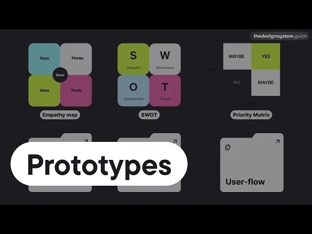
Imagine a system that generates prototypes based on comprehensive data analysis, including Empathy Maps, SWOT, Priority Matrices, and User Interviews. This would allow prototypes to adapt dynamically to different user personas and continuously evolve with incoming data. We would move so much faster from an idea to the market.

However, it's not just rainbows and butterflies. It requires substantial investment, effort, and vigilance against biases. Our goal should be to create algorithms based on diverse, accurately labeled datasets representing every customer.
AI reflects our society and our organizational processes. It's not a magical solution; it relies on the quality of input it receives. As AI grows smarter with data, training it inclusively and ethically is crucial.
How will everything fit together? It is on us!
We're all learning in real-time. Ultimately, AI isn't about replacing human creativity but augmenting it. We must be mindful of AI's evolution and impact on our lives.
My Talk
I talked about this topic on the DesignFao conference in October 2023.
Stay tuned for more ideas. ❤️

I'm Romina Kavcic. I coach design teams on implementing design systems, optimizing design processes, and developing design strategy.
