An Interactive Guide
What are
design tokens?
What are
design tokens?
So, what are design tokens?
So, what are design tokens?
Design tokens
Design tokens
Design tokens
are
are
are
nicknames
nicknames
nicknames
for
for
for
design elements.
design elements.
design elements.
Imagine you own a cat. Your cat’s name is “Lola.”
You also call her “Lolita,” “Loly,” and “Cutie.”
It's the same with tokens.
Imagine you own a cat. Your cat’s name is “Lola.” You also call her “Lolita,” “Loly,” and “Cutie.” It's the same with tokens.
🐈
🐈
your cat
your cat
still the same cat
still the same
Loly
Loly
yep, still me
yep, still me
Lolita
Lolita
meow, meow
meow, meow
⬇️
#FFDF38
#FFDF38
Core values, ready for use
Core values, ready for use
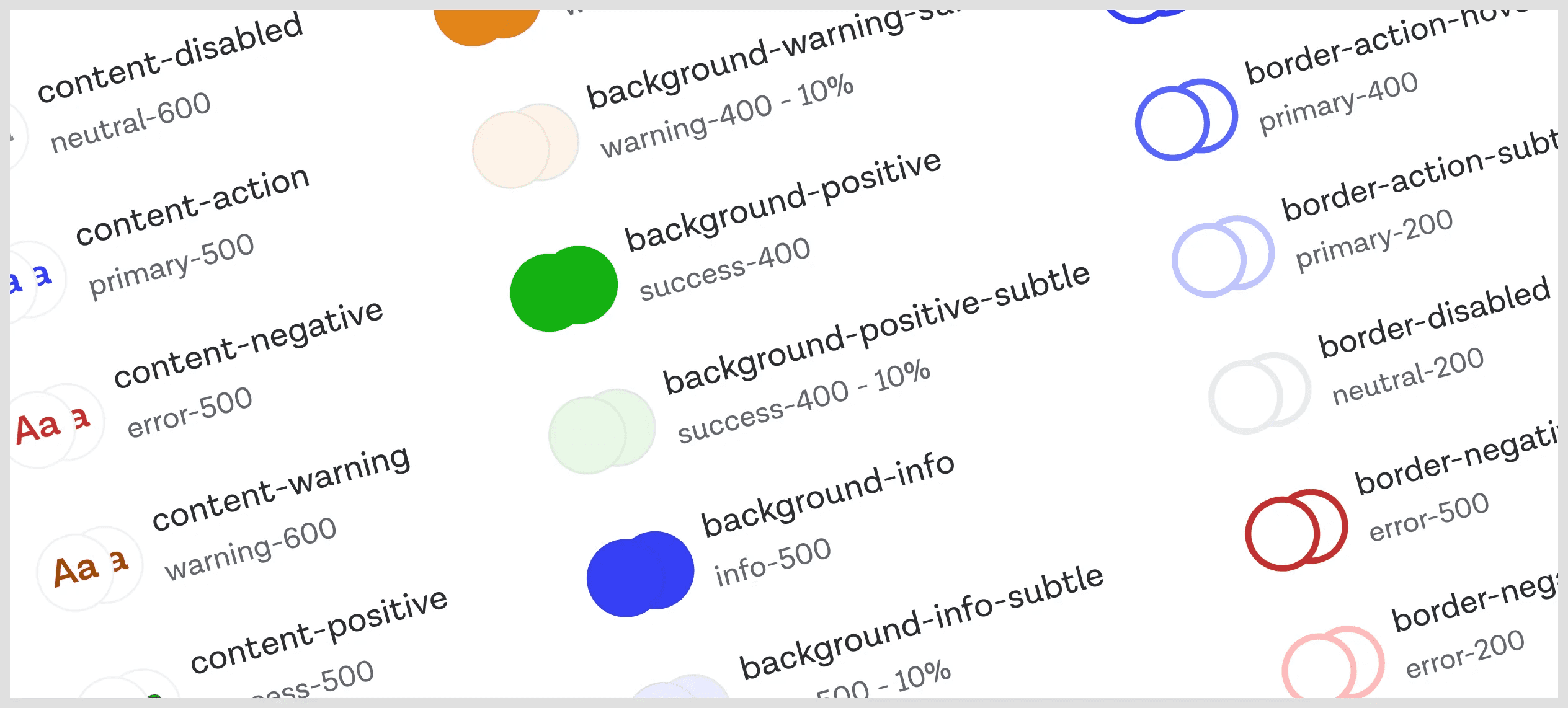
yellow-100
yellow-100
Essential design elements
Essential design elements
link-color-default
link-color-default
Basic tokens, ready for context
Basic tokens, ready for context
button-color-background-primary
btn-color-bg-primary
The building blocks of our design system
The building blocks of our design system
☝️
Our decisions
original
name
Design tokens
Design tokens
Design tokens
store
store
store
design decisions.
design decisions.
design decisions.
for all these types:
for all these types:
color
color
A
A
A
font
font
space
space
size
size
border
border
border radius
border radius
gradient
gradient
shadow
shadow
time
time
icons
icons
z-index
z-index
motion
motion
composite
composite
Instead of sharing hard coded values
Instead of sharing hard coded values,
#FFDF38
we create a shared vocabulary.
we create a shared vocabulary.
We define names our team understands.
We define names our team understands.
Design token levels
Design token levels
Design token levels
☝️
Click and play
Raw value
#FFDF38
Primitive
Semantic
Component
Computational
Adaptive
light
dark
Raw value
#FFDF38
Primitive
Global
Constant
yellow-100
Semantic
color-text-secondary
Component
color-button-text-secondary-active
Computational
"calc({spacing-base} * 1.5)"
Adaptive
"light": "{color.yellow100}"
"dark": "{color.green200}"
Raw value
#FFDF38
Primitive
Global
Constant
yellow-100
Semantic
color-text-secondary
Component
color-button-text-secondary-active
Computational
"calc({spacing-base} * 1.5)"
Adaptive
"light": "{color.yellow100}"
"dark": "{color.green200}"
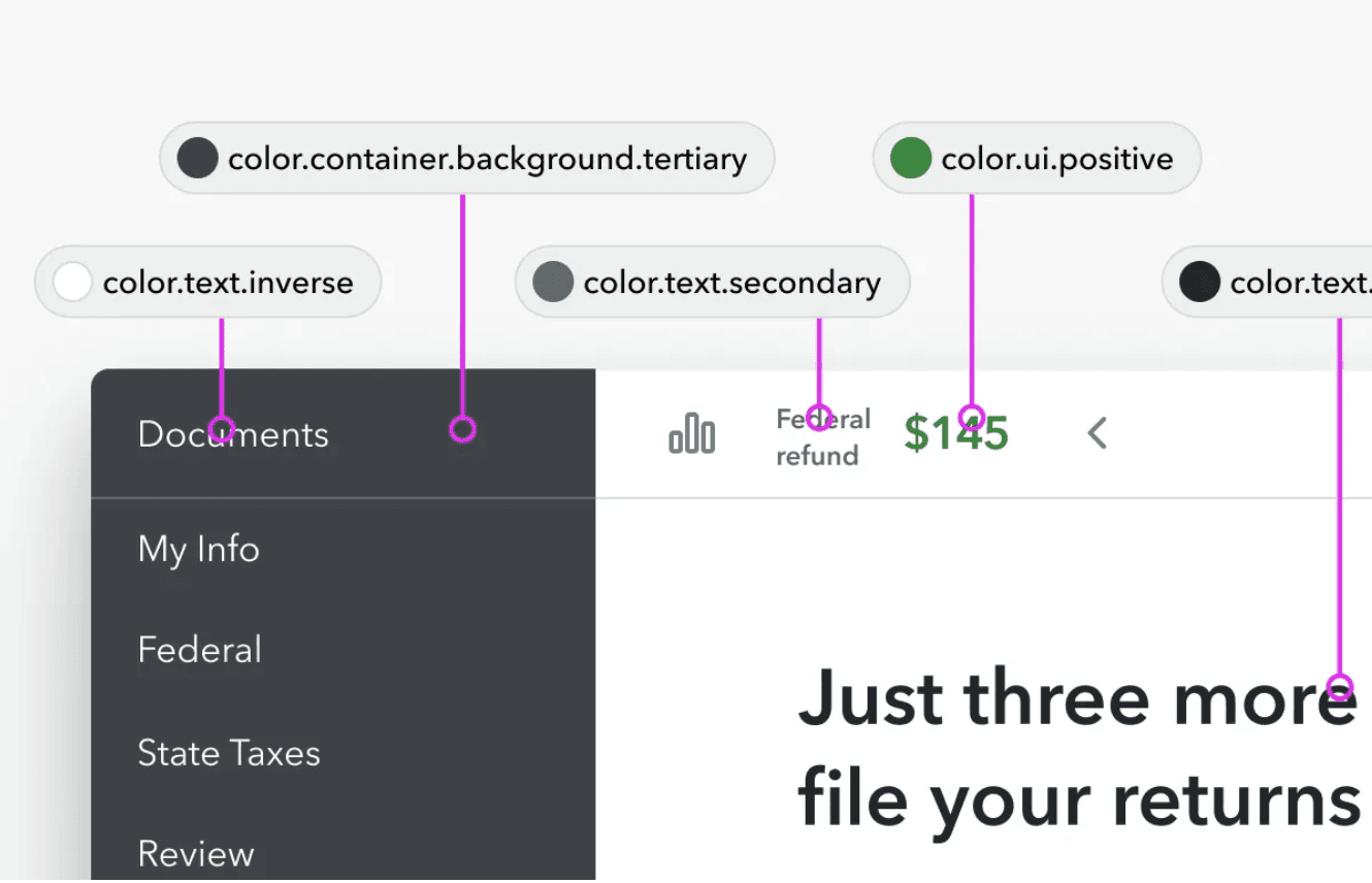
We start with Primitive design tokens, or 'Core' and 'Global' tokens. These tokens embody our basic design choices. Adding specific meaning or context transforms them into Semantic or Component-level design tokens.
We start with Primitive design tokens, or 'Core' and 'Global' tokens. These tokens embody our basic design choices. Adding specific meaning or context transforms them into Semantic or Component-level design tokens.
Composite design tokens
A
Text Style
font-size
weight
family
line-height
Border
color
width
style
Gradient
colors
Shadow
color
blur
spread
direction
"header-text-style": {
"font-family": "{font-family-header}",
"font-size": "{font-size-header}",
"font-weight": "{font-weight-bold}"
Composite design tokens
A
Text Style
font-size
weight
family
line-height
Border
color
width
style
Gradient
colors
Shadow
color
blur
spread
direction
shadow": {
"card-default": {
"xOffset": "{shadow.xOffset.small}",
"yOffset": "{shadow.yOffset.small}",
"blurRadius": "{shadow.blurRadius.medium}", "spreadRadius": "{shadow.spreadRadius.none}", "color": "{color.shadow.default}"
Composite
design tokens
Text Style
font-size
weight
family
line-height
Border
color
width
style
Gradient
colors
Shadow
color
blur
spread
direction
shadow": {
"card-default": {
"xOffset": "{shadow.xOffset.small}",
"yOffset": "{shadow.yOffset.small}",
"blurRadius": "{shadow.blurRadius.medium}", "spreadRadius": "{shadow.spreadRadius.none}", "color": "{color.shadow.default}"
Composite design tokens
Composite design tokens
combine multiple tokens to create a reusable styles.
combine multiple tokens to create a reusable style.
combine multiple tokens to create a reusable styles.
Token scales
Token scales
Token scales
With scales we standardize elements like:
With scales we standardize elements like:
space
space
space
size
size
size
time
time
time
z-index
z-index
z-index
A
A
text
text
text
color
color
We need to pick one system to follow.
1
1
1
2
2
2
3
3
3
4
4
4
5
5
5
numeric
numeric
100
100
100
200
200
200
300
300
300
400
400
400
500
500
500
numeric
numeric
xs
xs
xs
s
s
s
m
m
m
l
l
l
xl
xl
xl
xxl
xxl
xxl
sizes
sizes
low
low
low
medium
medium
medium
high
high
high
emphasis
emphasis
level-1
level-1
level-1
level-2
level-2
level-2
level-3
level-3
level-3
levels
levels
regular
regular
regular
active
active
active
heading
heading
heading
strong
strong
strong
sharp
sharp
sharp
pill
pill
pill
medium
medium
medium
card
card
card
small
small
small
full
full
instant
instant
instant
slow
slow
slow
medium
medium
medium
fast
fast
fast
Example for having a color with numeric names.
Example


Benefits
Benefits
HTML
<!DOCTYPE html>
<html lang="en">
<head>
<meta charset="UTF-8">
<meta name="viewport" content="width=device-width, initial-scale=1.0">
<title>Example</title>
<link rel="stylesheet" href="styles.css">
</head>
<body>
<div class="login-form">
<h2>Login</h2>
<form action="/submit-your-login-form" method="post">
<div class="input-group">
<label for="username">Username:</label>
<input type="text" id="username" name="username" required>
</div>
<div class="input-group">
Development
Development
Development
Design
Design
Design
When development and design are synced we get:
Faster development
Provides a single source of truth, reducing time spent on updates and allowing more focus on coding instead of fixing issues.
Consistency
Ensures uniformity across products and branding, making it easier to manage and reducing visual errors.
Less tech debt
Minimizes design and technical issues, saving resources.
Solid foundations
A stable design system that builds long-term value.
Shared vocabulary
Improves team communication by using a unified language.
Scalability and theming
Makes it easier to add new brands or themes.
Easier maintenance
Update once, and see changes everywhere instantly.
Update once, and see changes everywhere instantly.
Update once, and see changes everywhere instantly.
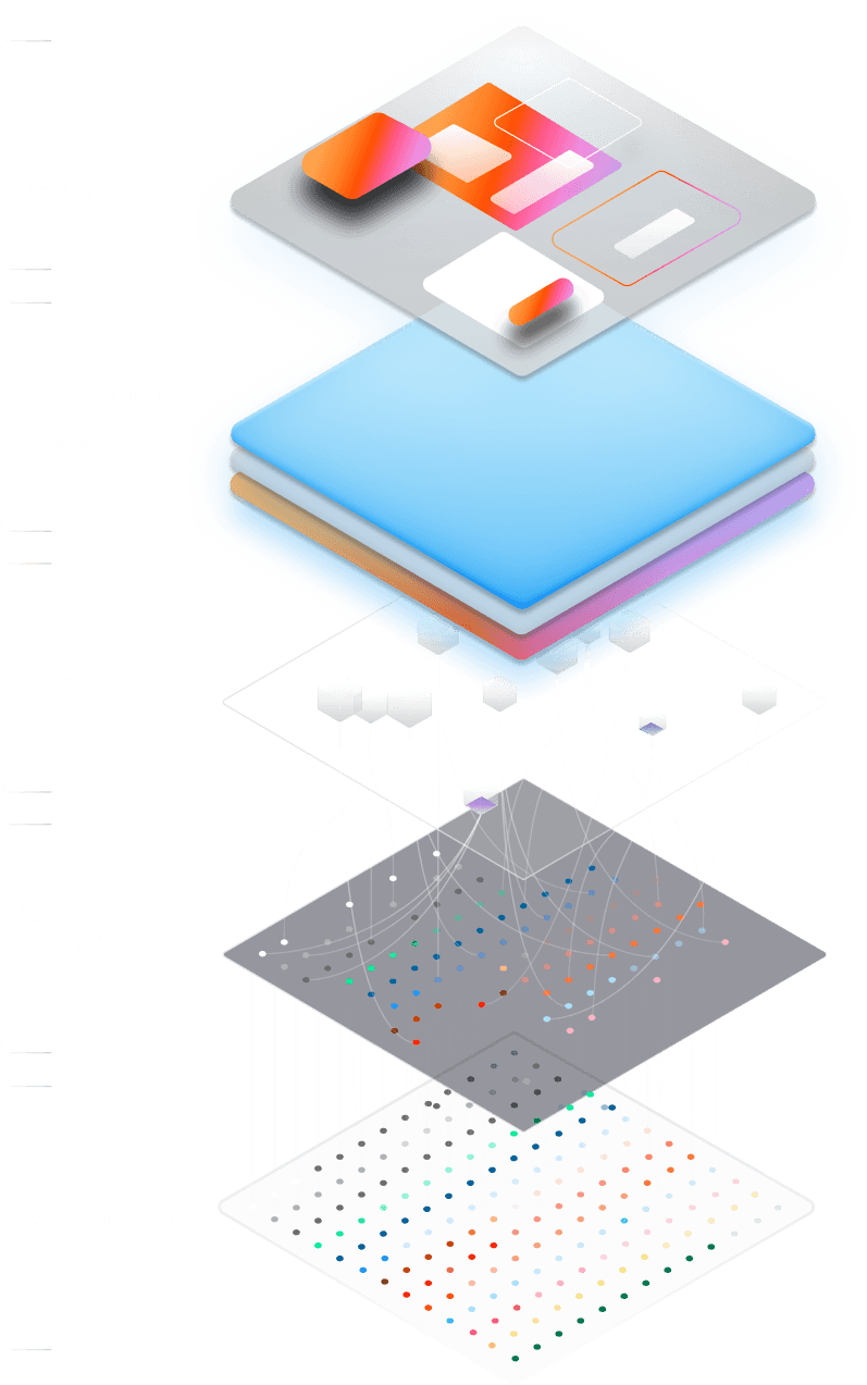

What users see
Choosing theme
Applying design tokens
Connecting
with global
design tokens
User
Interface
Design
Multi-brand
Design
System
Components
Semantic
Design
Tokens
Foundations
Multi-brand design system
Multi-brand design system
Multi-brand design system
Foundations
Semantic
Design
Tokens
Components
User
Interface
Design
Multi-brand
Design
System
Design Tokens Naming Structure
Design Tokens Naming Structure
Naming Structure
Names should be
Names should be
Names should be
Short
Short
Short
Meaningful
Meaningful
Meaningful
Clear, no jargon
Clear, no jargon
Clear, no jargon
Scalable
Scalable
Scalable
Flexible
Flexible
Flexible
Some well-known approaches:
C-T-I approach
category
category
type
type
item
item
color
bg
primary
color
color
bg
bg
bg
primary
primary
primary
BEM approach
block
block
element
element
modifier
modifier
color
color
bg
bg
bg
primary
primary
primary
Functional approach
component
component
category
category
subcategory
subcategory
state
state
role
role
button
button
color
color
bg
bg
neutral
neutral
disabled
disabled
Implementation steps
Implementation steps
Implementation
3
Design Tokens Inventory
Design Tokens Inventory
1
Workshop
Workshop
2
Naming Structure
Naming Structure
4
Implementation
Implementation
5
Launch
Launch
6
Theming and Scaling
Theming and Scaling
CI/CD pipelines
Version control
Automation
APIs
Testing
Code reviews
Linting
Visual
Visual
High contrast
Minimalistic
Light
Product/Brand
Product/Brand
Brand X
Brand Y
Product X
Accessible
Accessible
High contrast
Color Blindness
No animations
Platform
Platform
iOS
Android
TV
VR/AR
VR/AR
Low motion
3D elements
Token Integration Process
Token Integration Process
Token Integration Process
JSON
Transformer
Web
Mobile
Documentation
Figma
API
Plugins
Format
☝️
Transformer
Web
Mobile
Documentation
Figma
API
Plugins
JSON
Transformer
Web
Mobile
Documentation
Figma
API
Plugins
JSON
Tools
Tools
Design tokens
Design tokens
Design tokens
store
store
store
design decisions.
design decisions.
design decisions.
Less decisions,
Less decisions,
Less decisions,
less chaos.
less chaos.
less chaos.
Start small. ✌️
Start small. ✌️
Start small. ✌️
Learn more
Learn more
Learn more
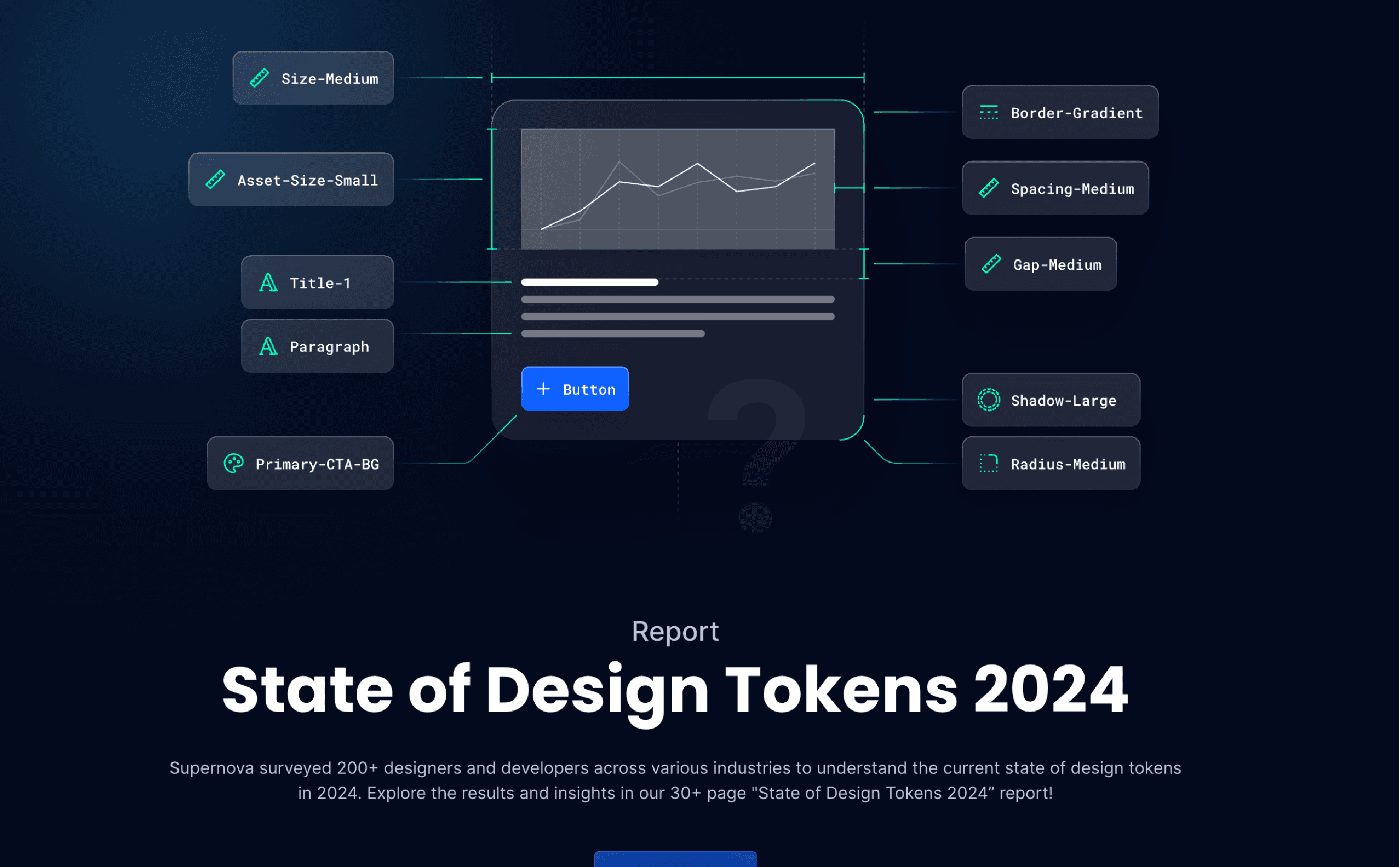
State of Design Tokens 2024

48,1% of respondents still prefer to craft their own naming conventions saying they values "ease of understanding" as their priority when naming.

State of Design Tokens 2024

48,1% of respondents still prefer to craft their own naming conventions saying they values "ease of understanding" as their priority when naming.
Let's connect
The Design System Guide Newsletter
Get new design system tips, tutorials, and insights in your inbox. No ads, no fluff.
© 2022 - 2025 The Design System Guide by Romina Kavcic
Let's connect
The Design System Guide Newsletter
Get new design system tips, tutorials, and insights in your inbox.
No ads, no fluff.
© 2022 - 2025 The Design System Guide by Romina Kavcic
Let's connect
The Design System Guide Newsletter
Get new design system tips, tutorials, and insights in your inbox. No ads, no fluff.
© 2022 - 2025 The Design System Guide by Romina Kavcic
